How flexibility can help your logo stand
In this article, we focus on the importance of logo flexibility and offer practical advice on how to use it effectively.
Flexible use of a logo for promotional printing
Flexibility in how a logo is used is an important part of modern branding. But what does it actually mean? Logo flexibility means adapting your logo to different situations and media without losing its identity and recognisability.
Flexibility in logo colors
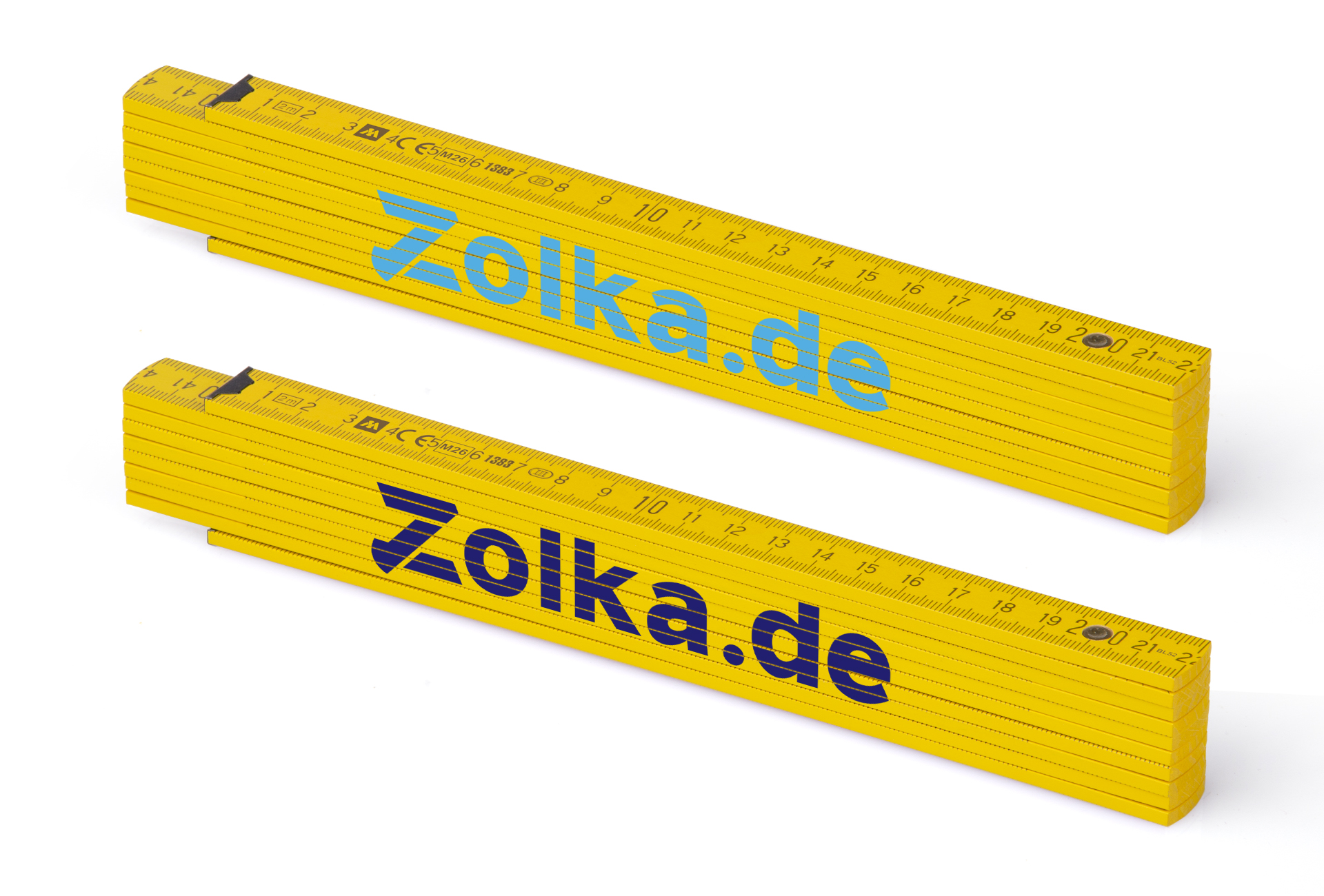
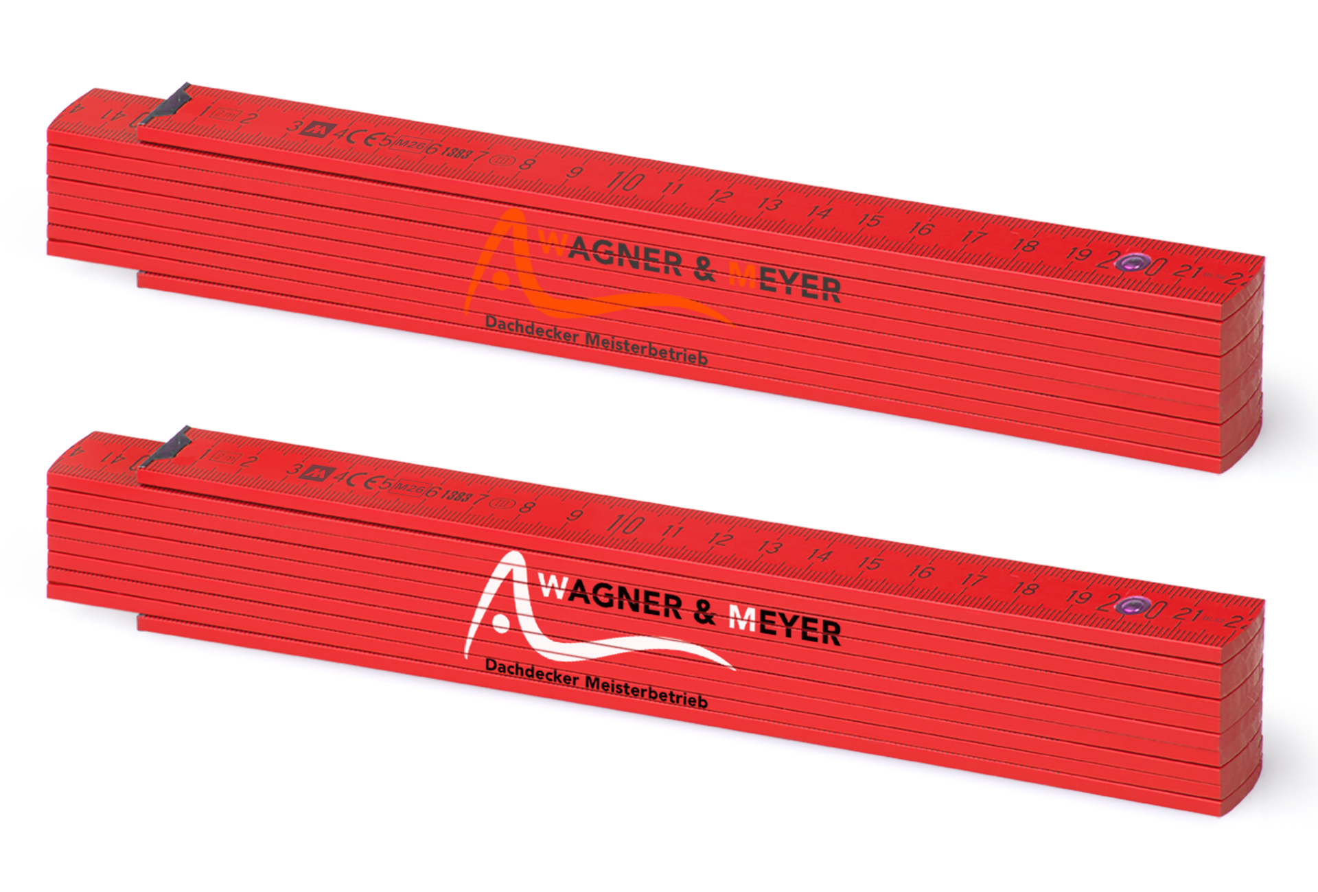
Imagine, for example, that you have a light blue logo and want to place it on a yellow folding ruler. Light blue and yellow may not work well together, making the logo difficult to see. If you are willing to adapt the logo color, for example by changing the blue to dark blue or black, you can achieve a stronger visual result while keeping the logo clearly visible and aesthetically pleasing.
Flexibility in logo layout
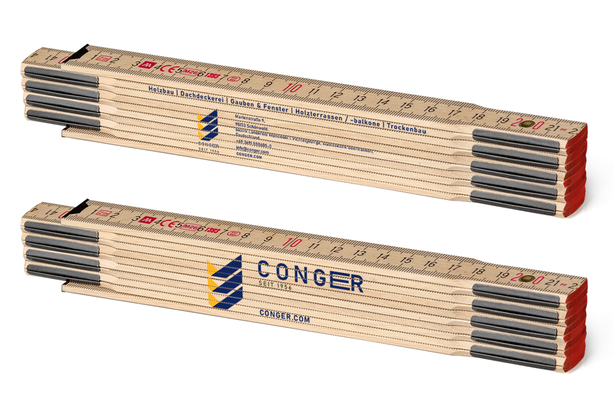
Logo flexibility is not only about changing colors. It can also involve adapting the size or proportions, or separating the wordmark from the graphic symbol to suit the size and shape of the promotional product. This helps ensure that your logo remains professional and effective regardless of where it is used.
Other reasons for logo flexibility
Another reason for keeping a logo flexible is that you may find a particular promotional product suitable for your campaign even though its available colors or dimensions do not work well with the original version of your logo. This is where flexibility becomes useful: a design or advertising agency can prepare a set of differently arranged and color-coordinated versions of your logo. These variants allow the logo to be used appropriately in different situations while keeping the brand consistent and professional even when the context or medium changes.
A logo for every situation
An advertising agency can prepare a range of logo variants suitable for different situations and promotional products. Professional designers can ensure that your logo remains clearly visible and aesthetically pleasing regardless of the color, size or dimensions of the product on which it is applied.
Colors do not have to be boring: adapt your logo to seasonal campaigns
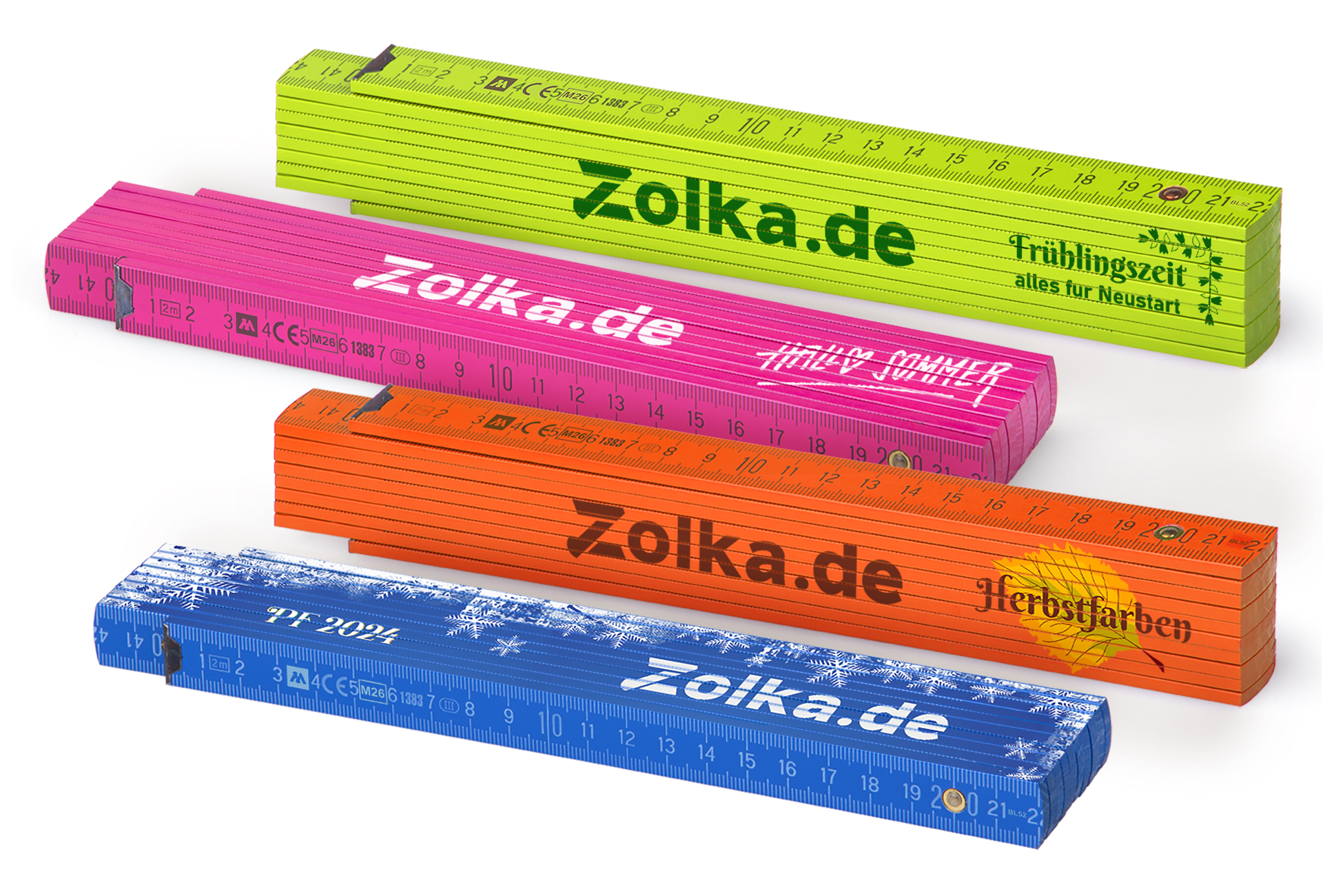
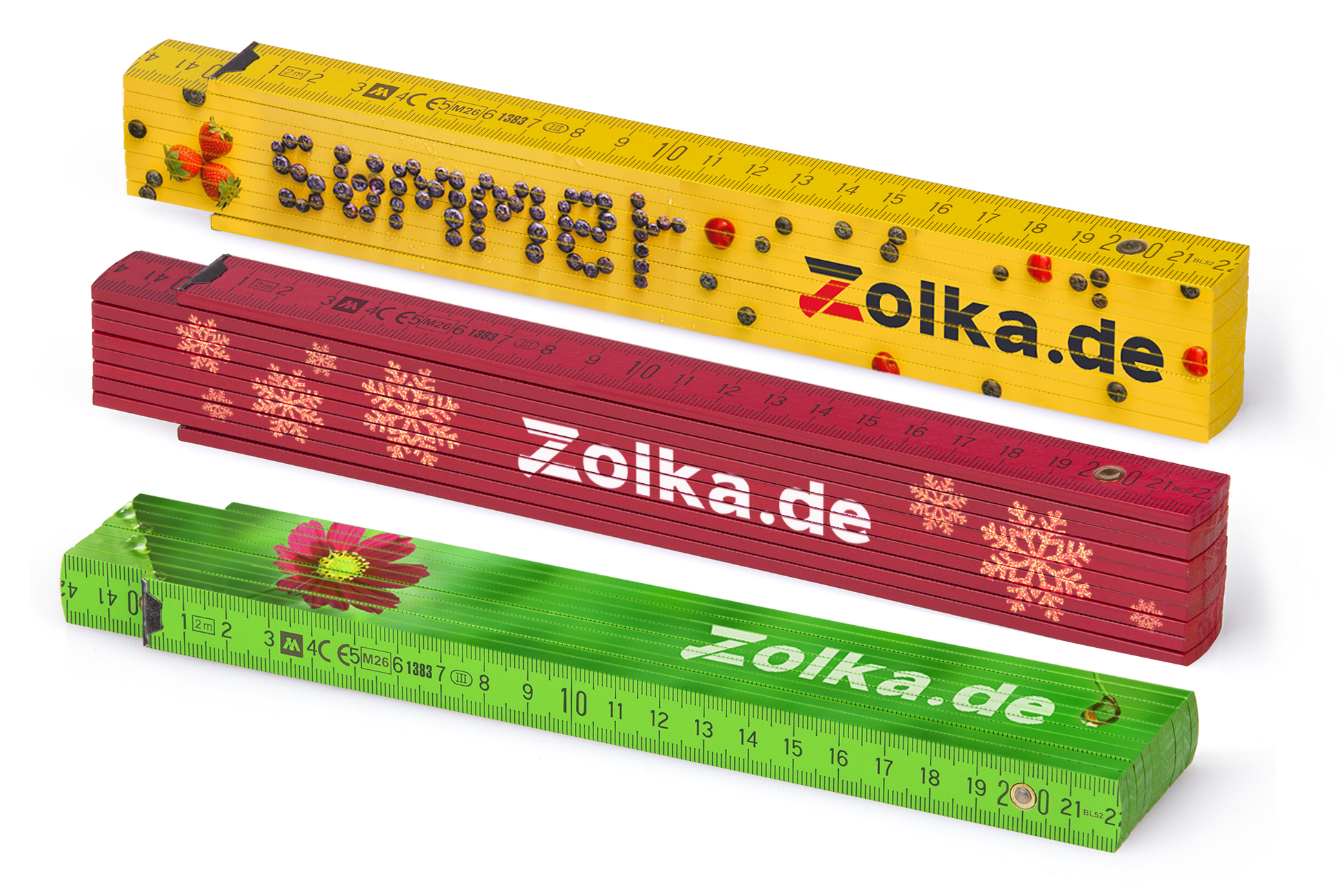
Color flexibility also makes it possible to create promotional campaigns for different seasons, themes or events, such as spring, Christmas or summer campaigns. Different colors of folding rulers combined with corresponding logo and wordmark colors can help tailor promotional products to a particular season or occasion.
History and development of flexible logo use
In the past, logos were often treated as rigid and unchangeable. Brands tried to maintain one design for every purpose, which limited their ability to adapt. Over time, major brands began experimenting with different versions of their logos, helping to establish the more flexible approach used today. A logo that worked well on a billboard, for example, might not have been sufficiently legible on a business card or a small promotional item. Brands such as Coca-Cola and IBM used variations of their visual identities across different advertising applications, packaging, products and markets.
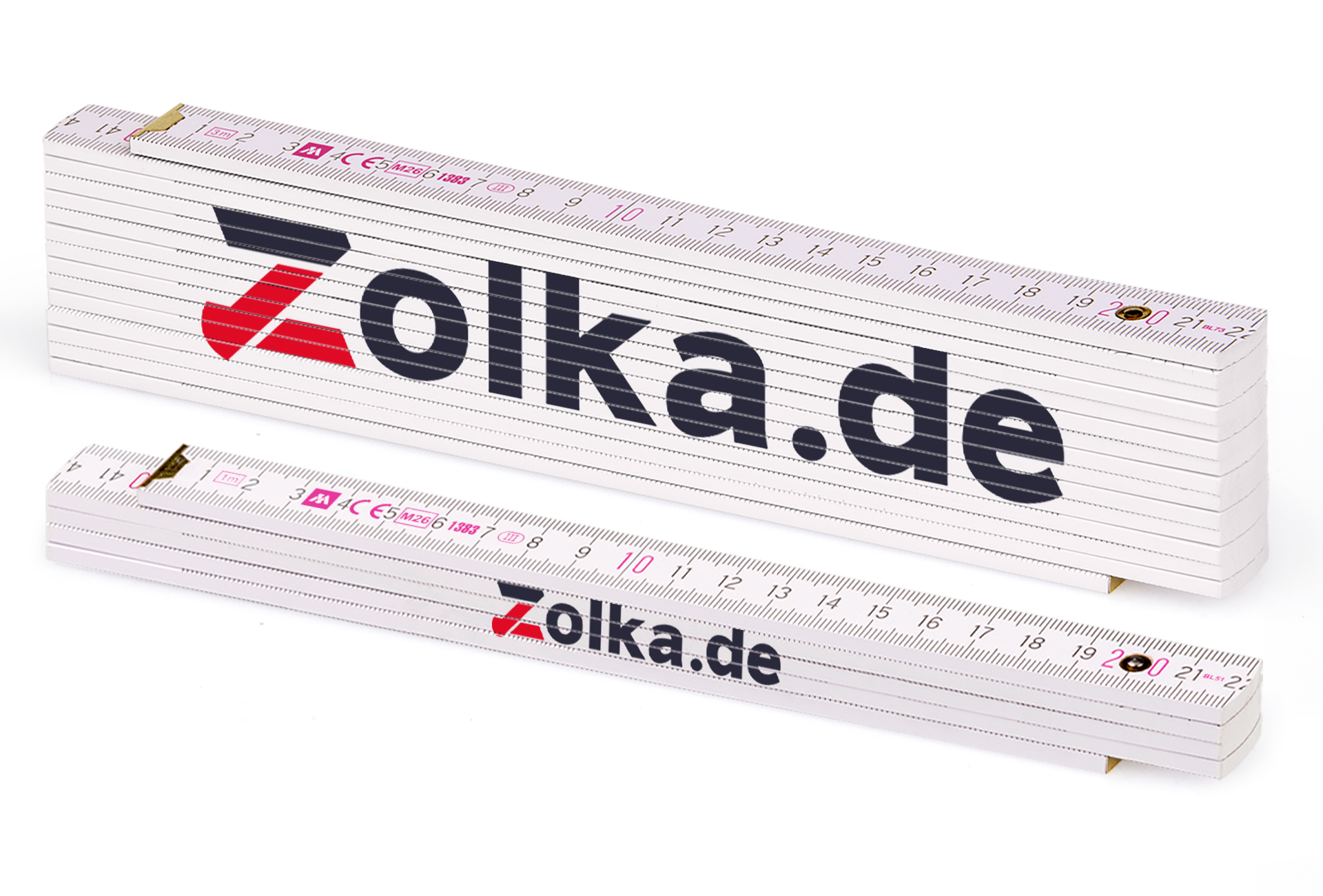
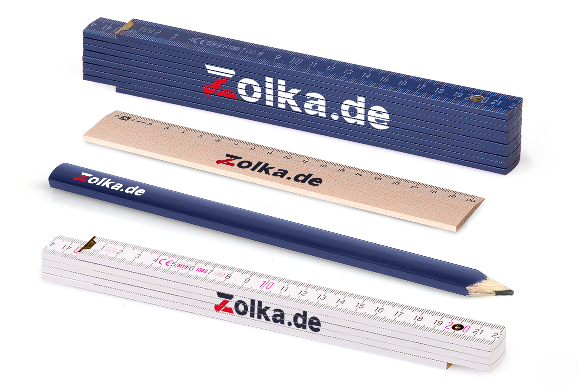
Example of flexibility: Imagine that your original logo is red and black and works well on a white background. You now want to use the same logo on promotional products such as dark blue folding rulers. The original version may not be sufficiently visible on the dark blue background. A flexible approach allows you to use a white or light-colored version so that the logo contrasts with the background while remaining clearly legible and visually appealing. This helps your brand remain consistent and professional regardless of the medium or context.
Modern trends Today, logo flexibility is standard practice. The digital era has introduced new possibilities and challenges that require logos to work across many platforms, from websites and social media to mobile applications, while still remaining suitable for traditional physical promotional products.
Principles of flexible logo use
Consistency vs. flexibility How do you find the right balance between consistency and flexibility? Consistency is essential for maintaining brand recognition, while flexibility allows a logo to adapt to different contexts and remain effective. Consider, for example, the difference between the smaller Block 51 folding ruler and the three-metre Block 53. On the smaller product, the logo may need to be adjusted to remain legible within the available print area, whereas the larger product offers more space. The color scheme may also need to be adapted so that the logo stands out on different backgrounds. The key is to preserve the main identifying elements of the logo while adapting other elements where necessary.
Color variants Using different color variants can help a logo work across different media, promotional products and situations. A light version may be suitable for a dark background, while a dark version may work better on a light background. A flexible color system helps keep the logo visible and aesthetically balanced.
Format variants Different versions of a logo, such as vertical, horizontal or symbol-only formats, make it easier to use the identity in spaces with different proportions. A horizontal logo may work well in a website header, while a compact symbol may be more suitable for a small print area. The same principle applies when printing on folding rulers and other promotional products.
Size and resolution It is important to have logo files suitable for different sizes and applications, from very small formats to large-format use. The logo should remain legible and retain sufficient quality regardless of size. When printing a logo on a folding ruler, the design must remain readable even at relatively small dimensions and should retain the important details of the original artwork.
Examples of successful flexible logo use
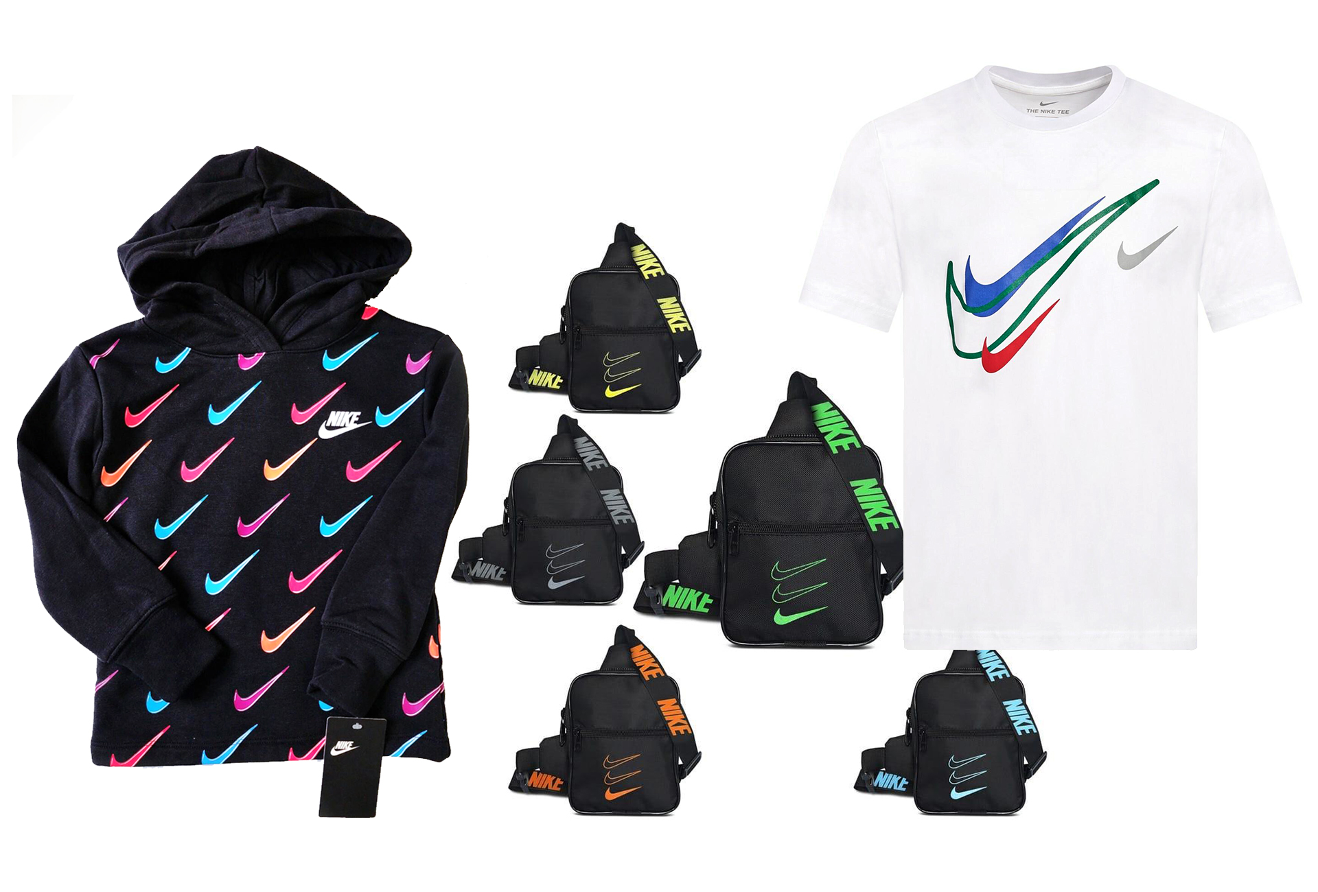
- Nike: Nike uses its iconic Swoosh in different colors and sizes, allowing it to work across a wide range of materials and products.
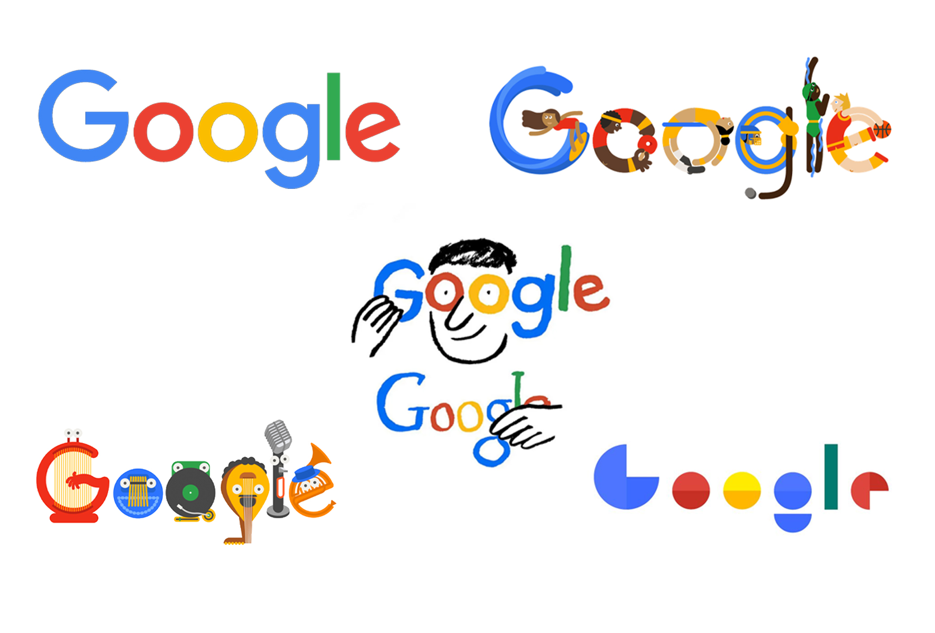
- Google: Google adapts its logo on its homepage for different events and occasions, demonstrating flexibility and creativity in the use of its visual identity.

- Example: Imagine that your brand is preparing a spring campaign using fresh greens and pastel colors. Your logo can be adapted to harmonise with the spring theme. For a Christmas campaign, red and gold folding rulers could be combined with corresponding logo colors to create a festive appearance. Summer campaigns might use bright, vivid colors such as yellow and orange to evoke sunshine and holidays.
- This flexibility in color not only increases the aesthetic value of promotional products but also makes it easier to tailor advertising to specific campaigns and different periods of the year. In this way, a brand can remain relevant and visually attractive throughout the year.
Examples of unsuitable logo use without flexibility
- XYZ Company: This fictional company insists on using a single color scheme regardless of context, resulting in situations where the logo is difficult to see and visually unattractive.
- ABC Brand: Another fictional example is a company that does not adapt the size of its logo to different media, resulting in poor quality and limited legibility at small sizes.
Tips and recommendations
How to implement logo flexibility
- Practical steps: Work with graphic designers to create different versions of your logo. Make sure you have a clearly defined brand or design manual specifying how and when the different versions should be used.
- Recommendation: Include logo flexibility in your branding and marketing strategy. Review the available logo variants periodically to ensure that they continue to meet your communication and application needs.
Tools and resources
- Design software: Tools such as Adobe Illustrator or Canva can be used to create and manage different versions of a logo.
- Sources of inspiration: Platforms such as Behance or Dribbble provide examples of flexible logo systems and identity applications created by professional designers.
Conclusion
Summary Flexible use of a logo is an important part of modern branding. It helps ensure that the logo remains visible, aesthetically balanced and recognisable regardless of the medium or context. The aim is not to change the identity of the brand, but to prepare suitable variants that allow it to work effectively in different applications.
Call to action Try using flexible logo variants for your brand. When preparing artwork for promotional printing, choose the version that provides the best contrast, legibility and proportions for the particular product and print area.
Payment methods



Shipping