The most common mistakes
Most designs can be created directly in the online configurator using PNG or JPG/JPEG files and your own text. Problems before production most often arise from insufficient artwork quality, an unsuitable image background, elements that are too small, an overcrowded design or missing information about the required corporate colour.
Below you will find the most common mistakes, how to recognise them and, most importantly, how to resolve them before submitting your order.
1. The logo is too small or low quality
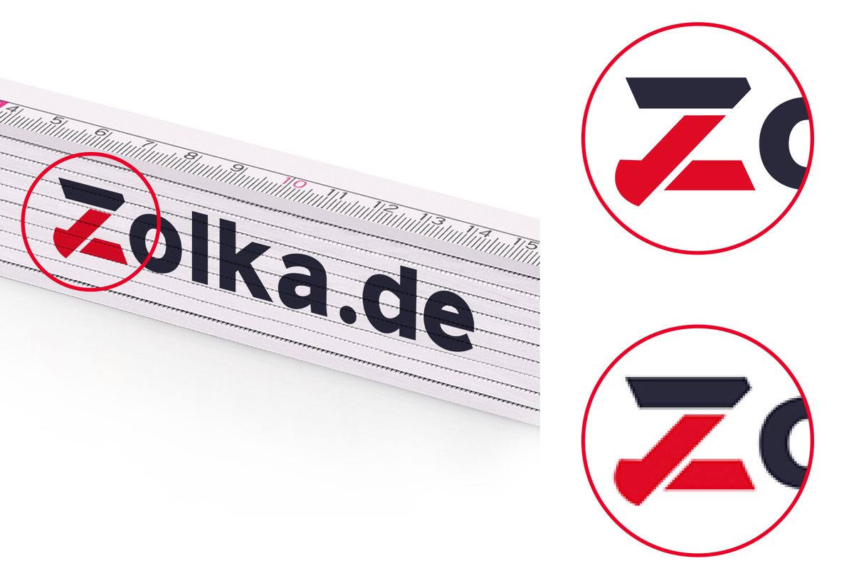
A small raster image may look fine on screen, but when enlarged it can reveal visible pixels, blurred edges or other defects. This applies particularly to small PNG and JPG/JPEG files.
What to do
First, try to find a higher-quality version of the same logo – ideally the original PNG or JPG/JPEG file at a higher resolution. If you have the original file, do not use an unnecessarily reduced copy.
If you have professional artwork files in SVG, PDF, AI or EPS format, keep them for printing. Use a PNG or JPG/JPEG file to create the design in the configurator, then attach the professional file to your order in the Cart.
Do not artificially enlarge a small logo or simply convert it to PDF. This will not restore missing image data or improve the actual quality of the artwork.
If you do not have a higher-quality file, use the best version available. If you are unsure whether it is sufficient for the required print size, contact us and we will check the artwork.
More: How to prepare a logo for printing
2. The logo has an unwanted white background
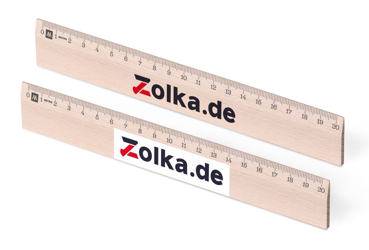
A white background may be part of the image itself. When the artwork is placed on the product, a white rectangle will then appear around the logo.
This typically occurs with JPG/JPEG files because this format does not support transparent backgrounds.
What to do
If you have the same logo as a PNG with a transparent background, upload this version to the configurator. The area around the logo will remain transparent, allowing the product surface to show through.
If you have several versions of the logo, check them. The transparent version is often saved as a PNG.
If you do not have a transparent version, use the best file available. There is no need to stop preparing your order because of the white background.
If the white background needs to be removed before printing, let us know with your order. We will check the artwork and tell you whether the background can be removed from the supplied file or whether a different file is required.
3. You are using a screenshot instead of the original logo
A screenshot is usually a poorer source file than the original. It may have a lower resolution, blurred edges, an unwanted background or contain other parts of the screen.
If the original logo file exists, use that instead.
What to do
Before using a screenshot, try to find the original logo file. It may be stored in your company files, corporate identity guidelines or among files used for your website or printed materials.
Ask the graphic designer or advertising agency that created the logo, corporate identity, business cards, catalogue or other printed materials.
Look primarily for a high-quality PNG or professional artwork files in SVG, PDF, AI or EPS format.
If you have nothing else available, use the best image you have. If in doubt, send it to us and we will check whether it is suitable for the required print.
More: How to prepare a logo for printing
4. Text or graphic elements are too small
The print area on some products is relatively small – for example, individual sections of a folding ruler or the printable area on a pencil.
Text or graphic details may be clearly visible when enlarged on a monitor, but at the actual print size they may be too small or difficult to read.
Potential problems include:
- very small text,
- thin lines,
- small symbols,
- small gaps between individual elements,
- highly detailed artwork reduced to fit a small print area.
What to do
Check the design with the actual size of the print area in mind, not only the enlarged preview on your monitor.
For important information such as a telephone number, website address or company name, prioritise legibility over the amount of information.
If the artwork is too detailed, simplify it or enlarge the most important elements.
If everything you need does not fit into one print area and the product offers additional areas, divide the content between them.
5. An important part of the artwork is too close to the edge of the print area
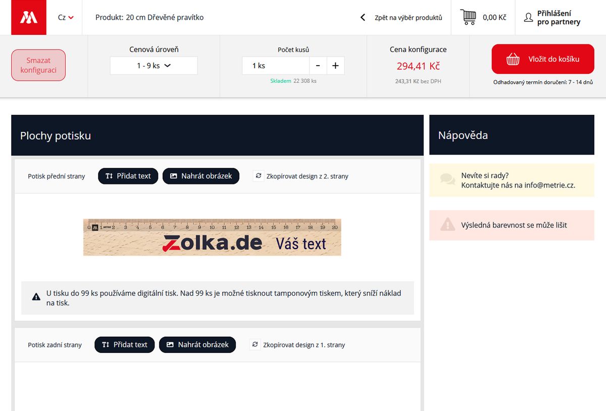
The configurator shows the print area available for the design on the relevant part of the product.
Placing text, a logo or another important element too close to the edge may impair the final appearance of the design and, with some printing methods, may also affect its feasibility.
What to do
Check the entire print-area preview, not just the logo itself.
Avoid placing important text, parts of the logo or other essential elements unnecessarily close to the edges of the available area.
If there is sufficient space, leave some visual breathing room around the main elements.
Use the configurator preview primarily to check the size, position and overall layout of the design.
6. You expect the colour on your monitor to match the print exactly
A colour displayed on a monitor is not an exact physical reference for the final print.
Different monitors may display the same colour differently. The final appearance of the print is also affected by the printing technology, ink, material, surface and base colour of the product.
What to do
If exact reproduction of a particular shade is not required, you can use the colours contained in the supplied artwork and choose digital printing.
If the print must match a defined corporate colour, find its Pantone (PMS) designation.
For supported products, pad printing with Pantone spot colours is available from 100 pieces.
Use the on-screen preview to check the design, not as a binding colour sample.
Colour on a monitor ≠ physical Pantone sample
More: Print colours – digital printing, spot colours and Pantone
7. The Pantone colour is determined only from an image or screen
If a specific Pantone colour is to be used, we need its Pantone (PMS) designation.
A Pantone shade cannot be reliably determined solely from how a logo looks on a monitor, from a JPG image or from an RGB or HEX value used on a website.
What to do
Check your corporate identity guidelines or logo documentation. Pantone designations for corporate colours are often specified there.
If you do not have these documents, contact the graphic designer or advertising agency that created the logo or corporate identity.
For a multicolour logo, identify the Pantone designation for each required spot colour.
When ordering, clearly specify which Pantone colour applies to each part of the artwork.
For example:
- blue part of the logo – PANTONE XXXX C
- red part of the logo – PANTONE YYYY C
8. You request pad printing for a photograph or colour gradients
Pad printing uses individual spot printing colours and is particularly suitable for logos, text and artwork with a smaller number of clearly defined colours.
Photographs, shading, colour gradients and artwork with a large number of shades have different requirements and are generally produced using digital printing.
What to do
For photographs, colour gradients, shading and a large number of shades, use digital printing.
For a logo consisting of several solid colours, particularly where they need to match specific Pantone shades, pad printing may be suitable.
You do not need to determine the printing technology yourself. For the order, the important thing is to provide the artwork, required quantity and any Pantone specifications correctly.
More: FAQ – Digital and pad printing
9. You have professional print files but do not attach them to the order
You use PNG or JPG/JPEG files to create the design directly in the configurator. However, this does not mean that professional artwork files cannot be used when preparing the order for production.
If you have the original SVG, PDF, AI or EPS files, attach them to the order in the Cart. For print preparation, they may contain higher-quality and more accurate data than the raster file used for the online design.
What to do
In the configurator: upload a PNG or JPG/JPEG file and create the required design.
In the Cart: if you have an SVG, PDF, AI or EPS file, attach the professional file to the order.
If you do not have professional artwork files, you do not need to create them just for the order. Providing them is optional.
More: Uploading artwork
10. You are trying to put too much information into the design
On a small print area, it is not always appropriate to include a logo, a long company name, address, several telephone numbers, email address, website and other information all at once.
A promotional print is primarily an advertising message – the most important information must be visible and easy to read. If there are too many elements, they compete with one another, have to be reduced in size and the resulting design loses clarity.
What to do
Decide what the recipient should see first.
Include only the information that is genuinely relevant on the product.
Shorten long text and remove information that is not essential to the purpose of the print.
If the product offers several print areas, divide the information between them.
Depending on the purpose, a suitable combination might be:
logo + website
or:
company name + telephone + website
11. You treat the configurator preview as an exact print proof
The online preview shows the content, size, positioning and approximate appearance of the design on the selected product.
It is not a physical colour sample of the final print. This is particularly important for orders where corporate colours are precisely defined.
What to do
Use the configurator preview to check:
- the correct logo or image,
- the accuracy of text and contact details,
- the selected print area,
- the size of individual elements,
- their positioning and relative proportions.
If specific corporate colours must be matched, do not rely on how they appear in the preview. Provide their Pantone (PMS) specifications and use the pad-printing options available for the relevant product and quantity.
More: Print colours – digital printing, spot colours and Pantone
What to do if you are not sure how to proceed…
You do not need to stop preparing your order because you are unsure about the artwork files.
Use the best available PNG or JPG/JPEG file to create your design.
If you have a professional SVG, PDF, AI or EPS file, attach it later in the Cart.
If you have defined corporate colours, provide their Pantone (PMS) designations.
If you are unsure about the quality of the artwork, the feasibility of a particular print or the suitability of the supplied files, contact us and we will advise you on the next steps.
Email: [email protected]
Phone: +420 606 766 253
Payment methods



Shipping